
Design system and component library
Project overview
My roles
- Planning and structuring of the design system
- Creation and testing of components
- Content documentation
Role
Senior UX Designer
Industry
Healthcare
Tasks
Design System, Components
Problem
The product designs were initially inconsistent and there was no for our designers or developers to follow to ensure design consistency. The product did not have an existing design system or component library or even a brand guide. With the growing product, design and development team, we needed to build a design system as part of the foundation to team collaboration.
Objectives
The goal was to create a design system that could:
- Align our team members by creating a set of standards to follow so as to ensure that cross team collaboration could be encouraged
- Speed up our design and development process: with a ready-made library of components and templates, we could create and test layouts much faster.
- Improve usability through consistent experiences across different user flows within the product and maintain functional familiarity.
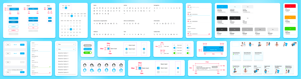
The construction of our design system
It was imperative that we create a scalable atomic system for improvements in productivity.

The Dispensary Design System
3 important factors in building the design system
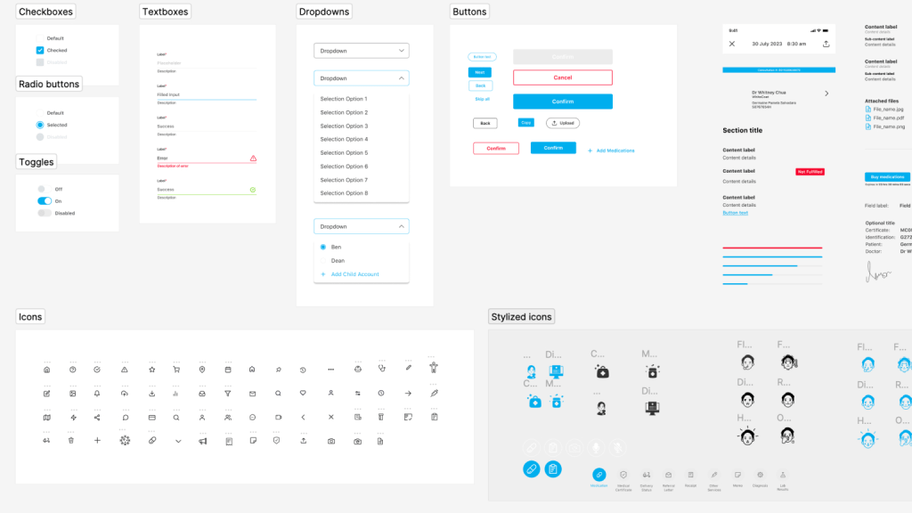
1/3 Creating scalable building blocks using the atomic design concept
When creating components and pages, we considered how every component and design could be made more flexible, such that it can serve more functions than a specific niche purpose. This is to prevent the component library from bloating unnecessarily, maintain consistency through the app, and maintain design familiarity amongst the users.

2/3 Logically labelling components and its contents
Accurate labelling helps with understanding what’s in a respective component and how to manipulate its variables. It also makes it easy for non-Figma experts to edit components for mockups and presentation decks. This is made even more convenient with the ‘properties’ feature in Figma.

3/3 Automating component flexibility and organisation
The key features that enable this in Figma include auto-layout, constraints, and frames.
Applying an auto layout to a frame’s content automatically organises the content within it following consistent spacing and margins. This helps organise content on a page within the bounds of the frame, and that there is equal, adequate spacing between page components. Features like these are especially useful for structured pages like forms and directories.

Conclusions
After the design system was implemented with both the design, development and QA team. The design consistency improved and the team’s efficiency increased by 150% since building this library.
Our next steps would be to involve our developers to ensure that pattern and interaction design includes code that can be used by developers in the future.
 Marie Wong