
Description:
About the Doctor’s Portal
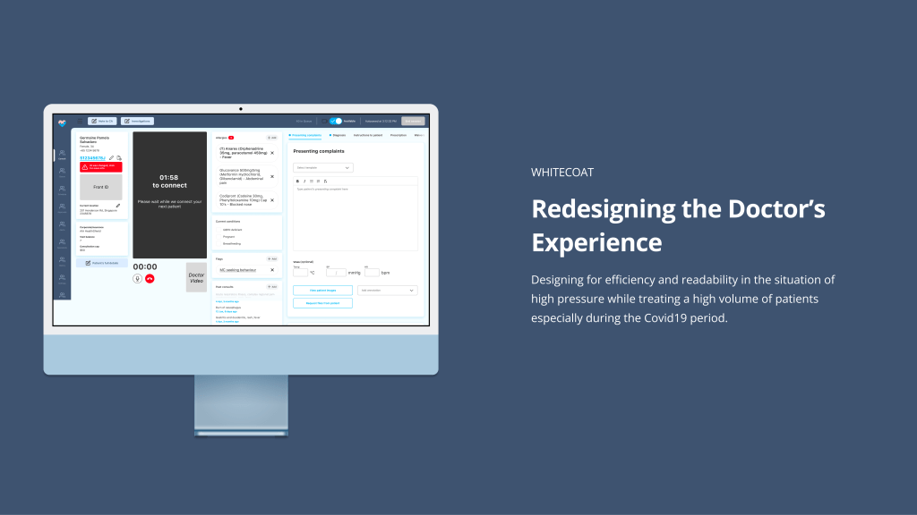
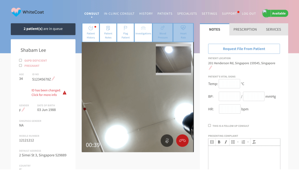
The WhiteCoat Doctor’s Portal is an internal tool providing doctors with a cohesive way to connect with, diagnose and prescribe medications to patients whilst being able to access their medical history and communicate internally on follow up needs and outpatient care.
Objectives
Whilst the current portal was functional, there were difficulties with navigation, accessibility and readability in which we needed to optimise for this solution and ensuring brand consistency.
With a 2 woman team, we hoped to be able to answer these questions along the way to gather some baseline data for the future:
1
What is it like being a tele-medicine doctor using an EMR system and what are their tasks
2
What are the nuanced characteristics of doctors, how may we uncover pain points in their current user journey in order to find ways for improvement
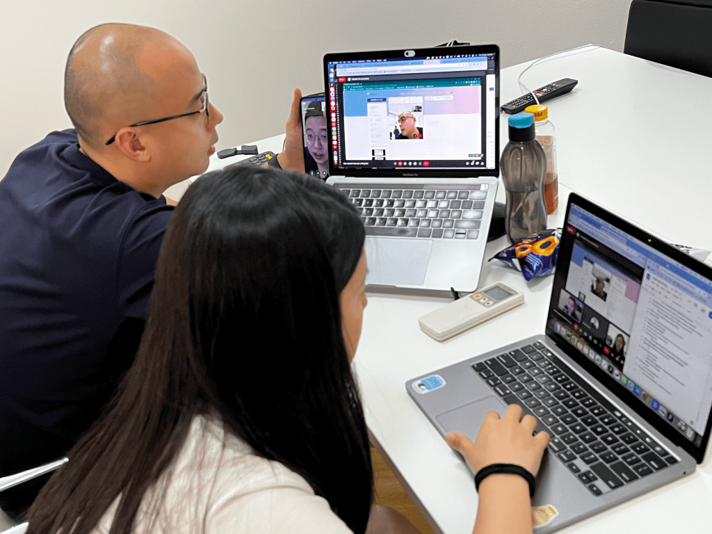
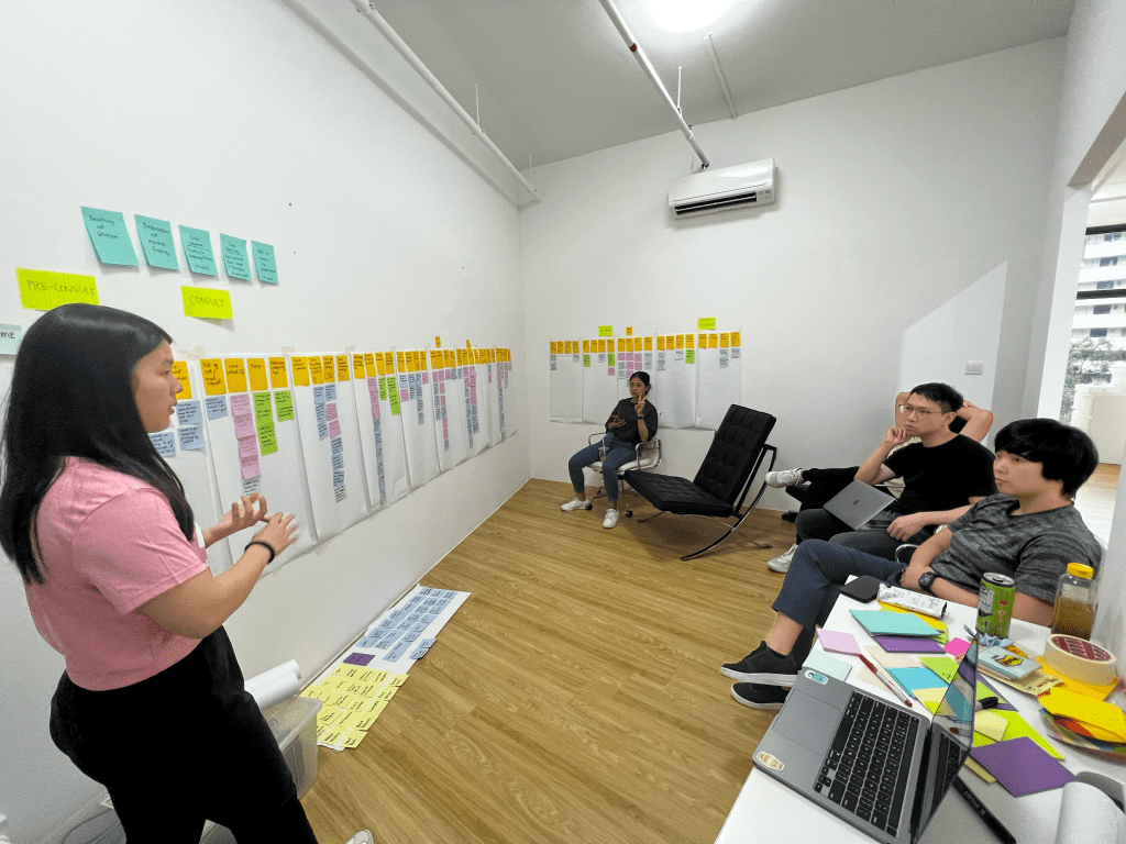
Gathering Insights
We conducted “Day in the life of…” style user interview/ testing to understand a standard user journey of a telemedicine doctor. So we could create a user journey and group common pain points identified under each action point.
Organising the insights
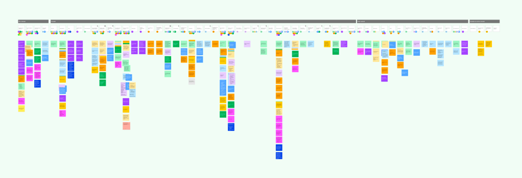
Doctor’s Tasks
Here is a list of tasks that are needed to be completed:
1. Check and access full medical/historical record
2. Managing the number of patients in queue based on ailment type
3. e-KYC – Patient and ID verification
4. Triage – is the patient suitable for tele-consultation, do they have certain conditions that doctors need to be aware of?
5. Consultation environment – troubleshooting the patients surroundings to ensure consultation smoothness
6. Investigations – checking lab results or health screenings to note on other chronic health concerns patient may have before considering diagnosis or prescription
7. Diagnosis – asking the right questions in order to make the right diagnosis
8. Prescriptions/Treatment – identifying the right medication and lab services for patients.
9. Billing – checking if patient is under the correct insurance policy for claiming medication
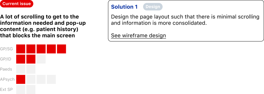
So, what were some of the pain points of this design?
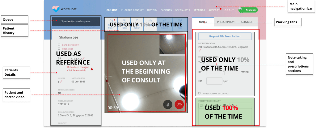
Inconsistent use of sections, users are finding loopholes.
(See examples below)

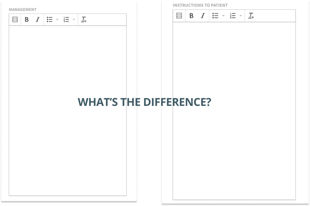
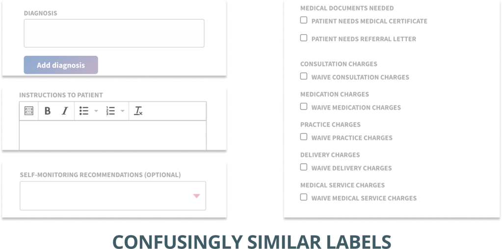
Poor placement of information and content for usage
(See examples below)
A slightly fully list for light reading
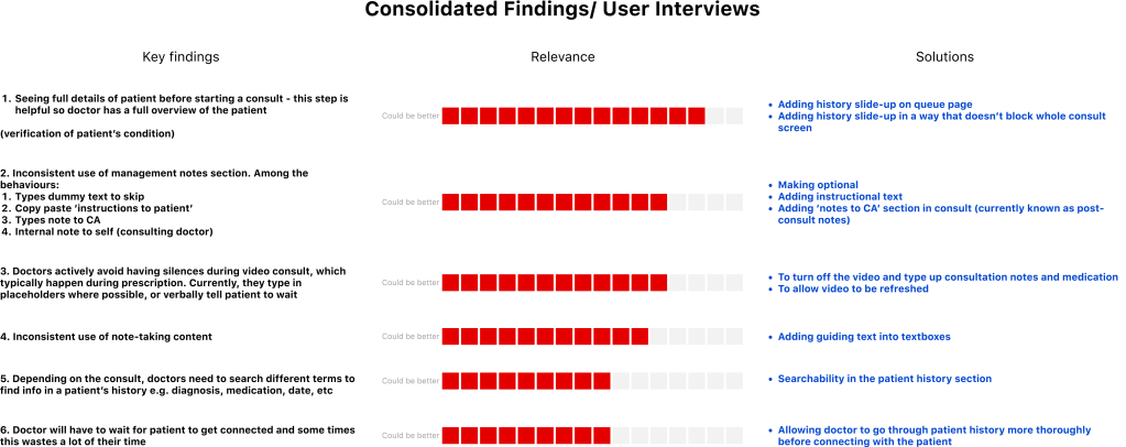
Topics of improvement
User experience
Information architecture
Information access
Search-ability
Quick access
Consistent copy & signifiers
User interface design
Readability
Page layout
Positioning of content
So, all in all, quite a lot of things to worry about:
Shifts are extremely high pressured
Doctors could be dealing with hundreds of patients in queue a shift and this requires them to be as efficient as possible whilst managing a good bedside manner as well as managing company e-kyc and being aware of patient insurance if the medications are not covered. Doctor’s are aware that their time is being measured and therefore would like to finish their consults within a 10 minute window.
Information is overloaded
Whilst knowing that the consults should be completed within a certain amount of time, doctors also have to remember labels and codes from their doctor’s manual called the ICD10. They also need to remember quite a lot of information regarding patient insurance, referrals, medications, dosage, allergies, etc.
Individualised templates and processes for efficiency
Each doctor has their own personal way of managing their efficiency while using other methods of note taking and templating to get their job done.
Efficiency is a plays a huge role in consulting with a family doctor especially in the midst of surging Covid19 cases.
How do we improve efficiency whilst creating more brand cohesiveness?
Efficiency plays a huge role in consulting with a family doctor especially in the midst of surging Covid19 cases.
How do we improve efficiency whilst creating more brand cohesiveness?
Our strategy for design
Based on the above pain points, these were the general thoughts we had going into designing the solution

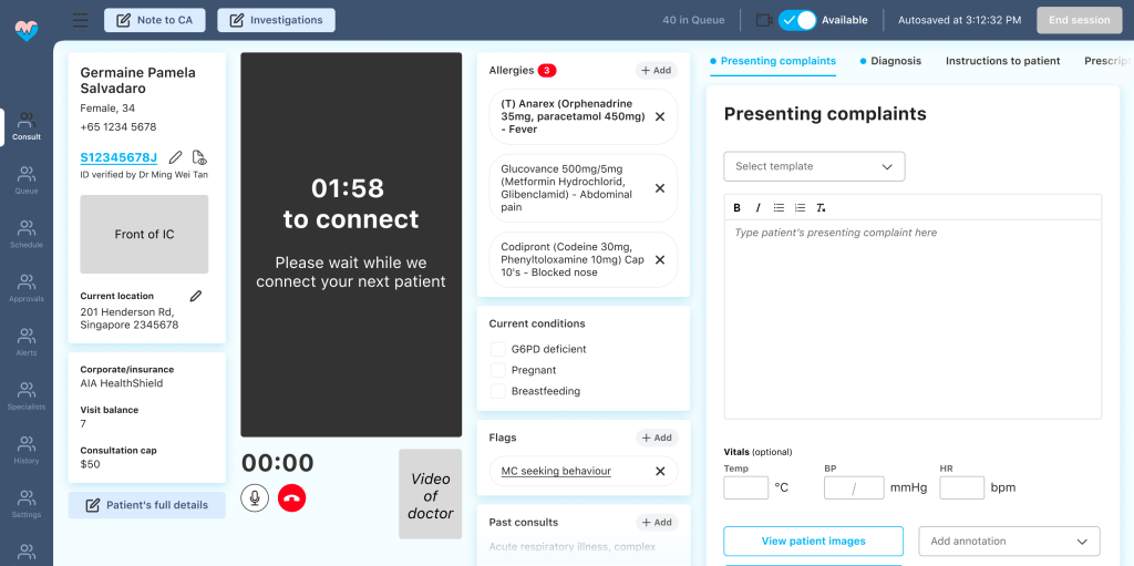
Our final design
We created sections which were scrollable except for the video, to allow doctors to refer to information in each section.
Increased the font size and ensured colour readability and consistency across the platform for improved readability
Improved on clearer signifiers to indicate existing information or information that needs to be input
Larger working space for presenting complaints as a wider frame for writing is more readable.
Better information hierarchy by organising by importance and improved interaction through scrolling.
Thoughts and learnings
We created sections which were scrollable except for the video, to allow doctors to refer to information in each section.
Since the final design and positive feedback from our involvement with stakeholders as well as the successful usability testing we were able to win more team members as well as further implement the usability testing into our regular process.
Some key take aways from the project are:
1. Involve stakeholders in the process as much as possible – with people who use the product as much as the doctors do, in their everyday life, it’s important to involve the users early and often. They will not only be grateful that your care but they will help as
2. Creating a revamp roadmap and plan is never a waste of time – it helps with identifying how you plan to ensure your design will have the highest possibility of success
3. Creating a design library with logic is tedious now but it will save you later on – because it help you and your product manager create tickets simply and easily and will ensure that developers will not need to come back and ask you more questions
Evolution of the portal
Product:
Doctor’s Portal
Platform:
Web only
Project Duration:
6 Months
Role:
UX Lead
Team:
1x UX Lead
1x UX Designer

