
WhiteCoat Global
On-Demand Telemedicine Service
Background
Redesigning the main patient mobile application. Created a design system and an improvement in the readability.
Timeline
3 months
Role
Design & Testing
Stakeholders
Local patients, operations team, business management
Tools
Figma
Discovering Business & User Needs
The Challenge
How do we improve the consistency of the branding for accessibility and readability thereby improving business function?


Goals for the redesign
Usability
Users should be able to find what they need at a glance. Since this is a telemedicine app which essentially allows them to use their corporate insurance policies.
Business Operations
One of the main reasons why we want to improve the readability, is to manage the number of errors, particularly when users select their insurance policies. If we can improve our readability here, this would substantially reduce the number of calls we would get through customer service for trouble shooting. These troubleshoots take up the bulk of time spent by the operations team.
Metrics to evaluate success
A significant decrease in the number of calls taken by customer service on policy selection.
Competitive Analysis
Market Analysis
Analysed direct competitors in the market such as Doctor Anywhere, Speed Doc, MaNa Doctor and more to understand their strengths and how our USP compared to theirs.
Goals:
Establish what the market looks like and also learn what language is familiar to users.


Findings
These apps cater quite closely to retail customers and do not deal heavily with policy add ons compared to WhiteCoat.
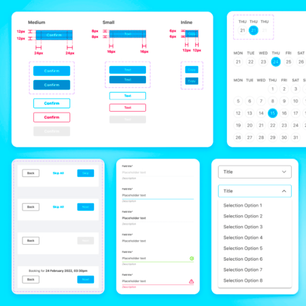
Design System
Goals
Create a design system to help our team to have a consistent library to go to to find patterns, icons, components, measurements, code and typography.
Results
The product’s team turn around time improved by 75%! With a consistent system to follow, designs were created very quickly and developers had ready built patterns that they could use as needed. All in all, our communication and speed improved significantly as a result.


Test, redesign, test
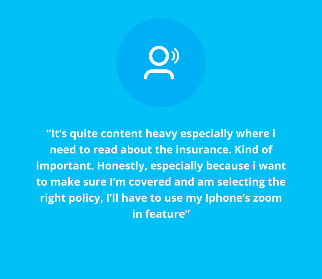
Usability testing and findings
Goal:
Find out how people use the app, and what their perceptions are. What friction points do users usually run into?
Results:
The biggest takeaway is that users generally understood how the app works but tended to make small mistakes due to the lack of readability in the size of font and the amount of content that users needed to consume at one go.
Redesign and test
Goal:
Understanding what kind of design work, structure and concepts.
Results:
Our final design focused on data that showed which services were used most as well as highlighting, newer services that we wanted further traction. UI elements that like larger bold headers helped to further improve the accessibility of the product. Brighter illustrations were also used to enhance the delight in our product despite the heaviness as a healthcare product.


Content reorganisation
Goal:
Make content easier to find with better labelling and clearer content
Results:
Testing showed that users found things more easily, since improving the information architecture of content heavy sections. By sectioning the content as well as increasing the font size this drastically improved the speed at which users were able to find what they were looking for.
Tools:
Optimal Workshop
Content Strategy
Adjusting content to improve understandability
From content overload


To something simple
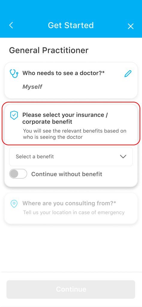
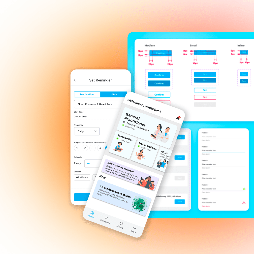
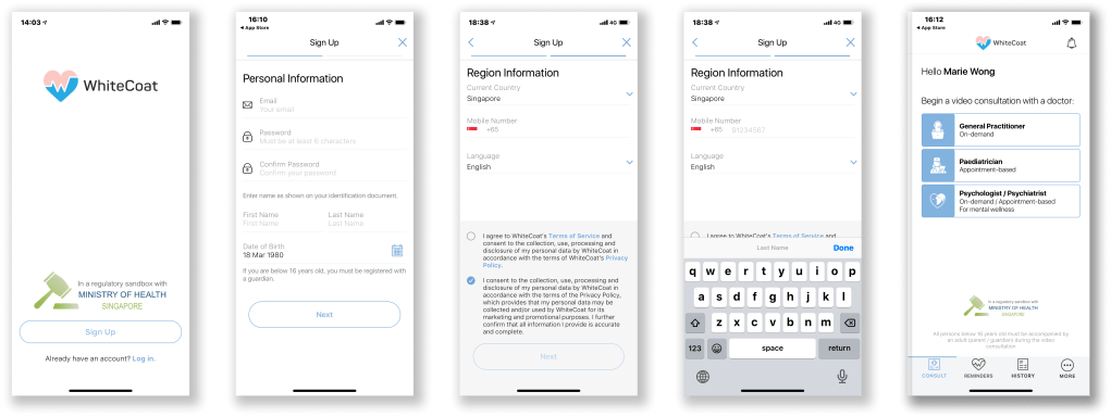
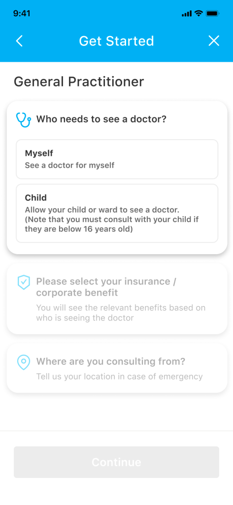
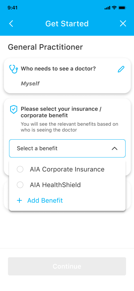
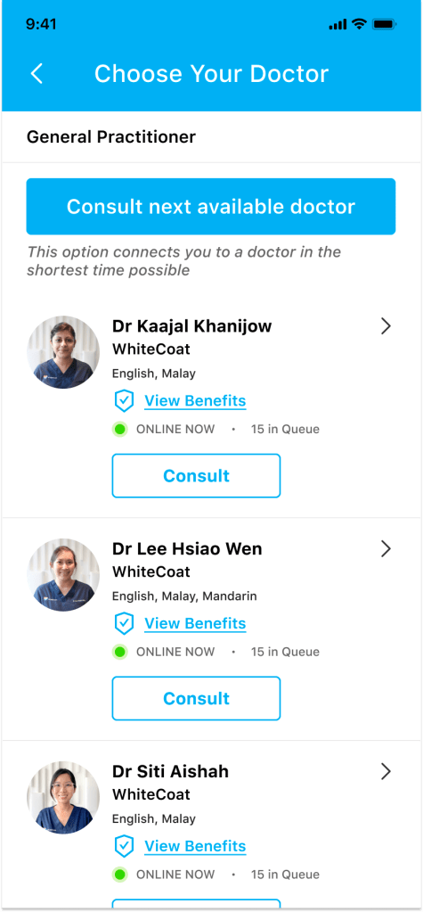
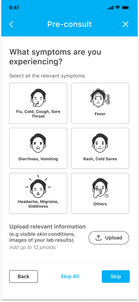
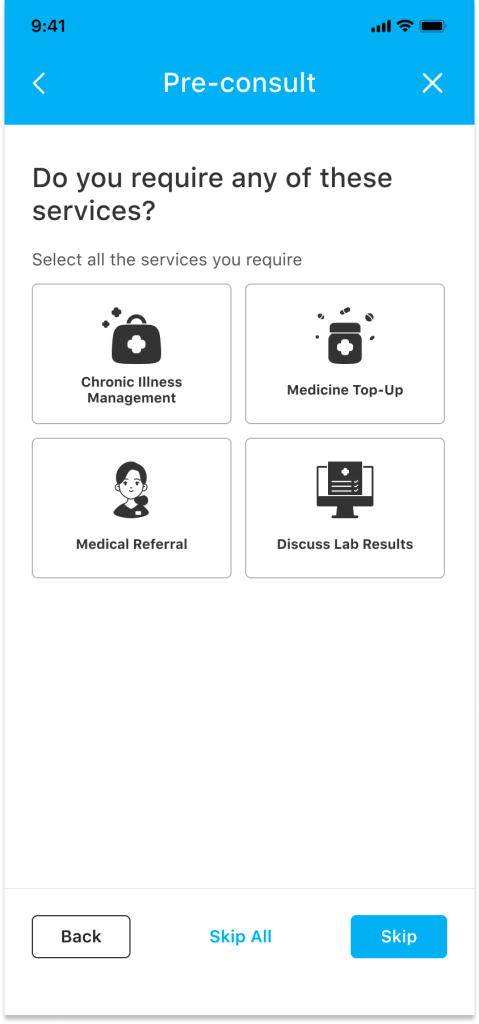
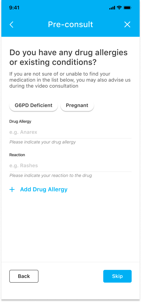
Finalised Product & User Journey
Consulting a General Practitioner
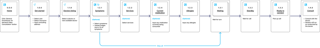
High Fidelity MVP Design flow


Final Thoughts
I really enjoyed this project, I got to dip my feet into, design system, product management, content strategy and way more usability testing and data collection than I thought. All-in-all, especially having done this project as the sole designer and product owner, I think it went as well as it could have gone considering our timeline and headcount. I couldn’t do this without my CPO Jessica, Product Manager Germaine, Android Engineer Thu Thu, IOS Engineer Yi Teng and my new team member Sheng who I managed to hire at the tail end of this project. Without these people, we would have never had lift off. This redesign was officially released in June 2022. The designs and procedures have since improved after implementation and have grown significantly leading way to our next gargantuan piece to tackle called “The Doctor’s Portal”. It’s EMR SASS product intent giving access to all patient history and a seamless way for doctors to diagnose from the ICD10 and prescribe from our internal dispensaries. On to the next adventure…
